Product Guides
Answer a quantitative item with a visualization
Quantitative items — energy, water, waste, headcount, emissions — are answered with a figure that comes from a visualization built on your uploaded data. This guide shows how to find one, attach the visualization and what to write alongside it.
Before you start
You need an Editor role in your Dcycle organization.
Steps
Step 1
Build the visualizations before you come here: they are what the dropdown offers. For an EINF you typically need emissions by scope with a prior-year comparison, electricity and total energy, water, waste split into hazardous and non-hazardous, and refrigerant gases if you have them.
Step 2
You do not load these figures again for the EINF. Data lives in the organization, not in the project: if you already run a carbon footprint project with your facilities, vehicles and invoices in it, those same records feed the EINF. Open “Dcycle categories” inside the project and you will see them — the note at the top says these are the categories configured for this project, and that you change them in Project settings.
Step 3
So for the environmental quantitative items, the work is not data entry: it is building the visualization that turns those records into the figure the item asks for — energy in MWh, water in m³, waste in tonnes, emissions in tCO2e — and linking it. A company with its footprint already in Dcycle can close this whole block in an afternoon.
Step 4
What a footprint project does not bring: the Own workforce figures (headcount, contract types, pay, training, equality), the policies and strategy documents, and the certifications. Those you do have to fill in — through the matching Dcycle categories — before a visualization can answer their items.
Step 5
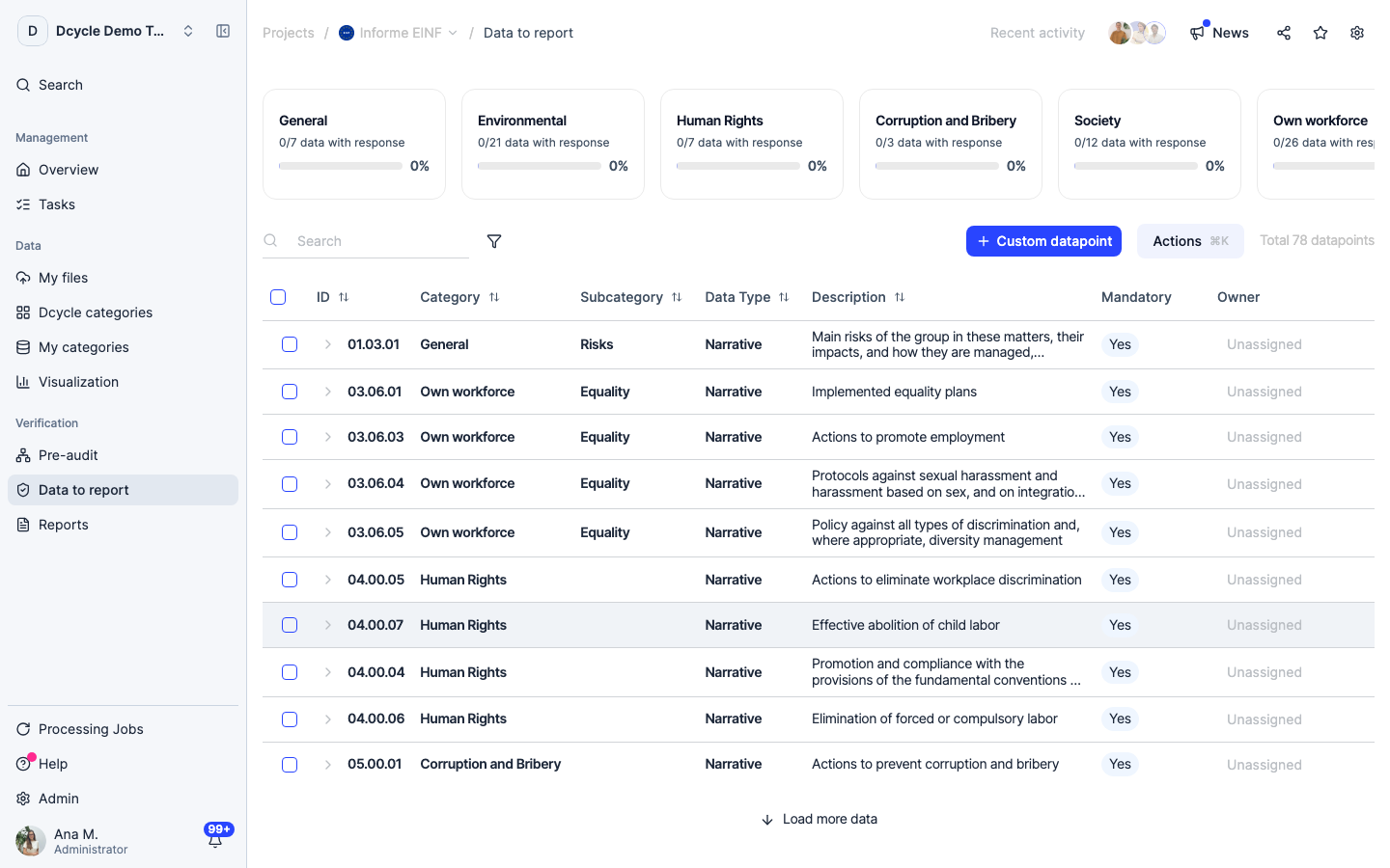
Find a quantitative item. The table loads in batches and its first page is mostly narrative, so sort by the “Data type” column or use “Load more data” at the bottom until quantitative rows appear. Then click the item’s description to open it.
Step 6
Open the first quantitative item in the list.
Step 7
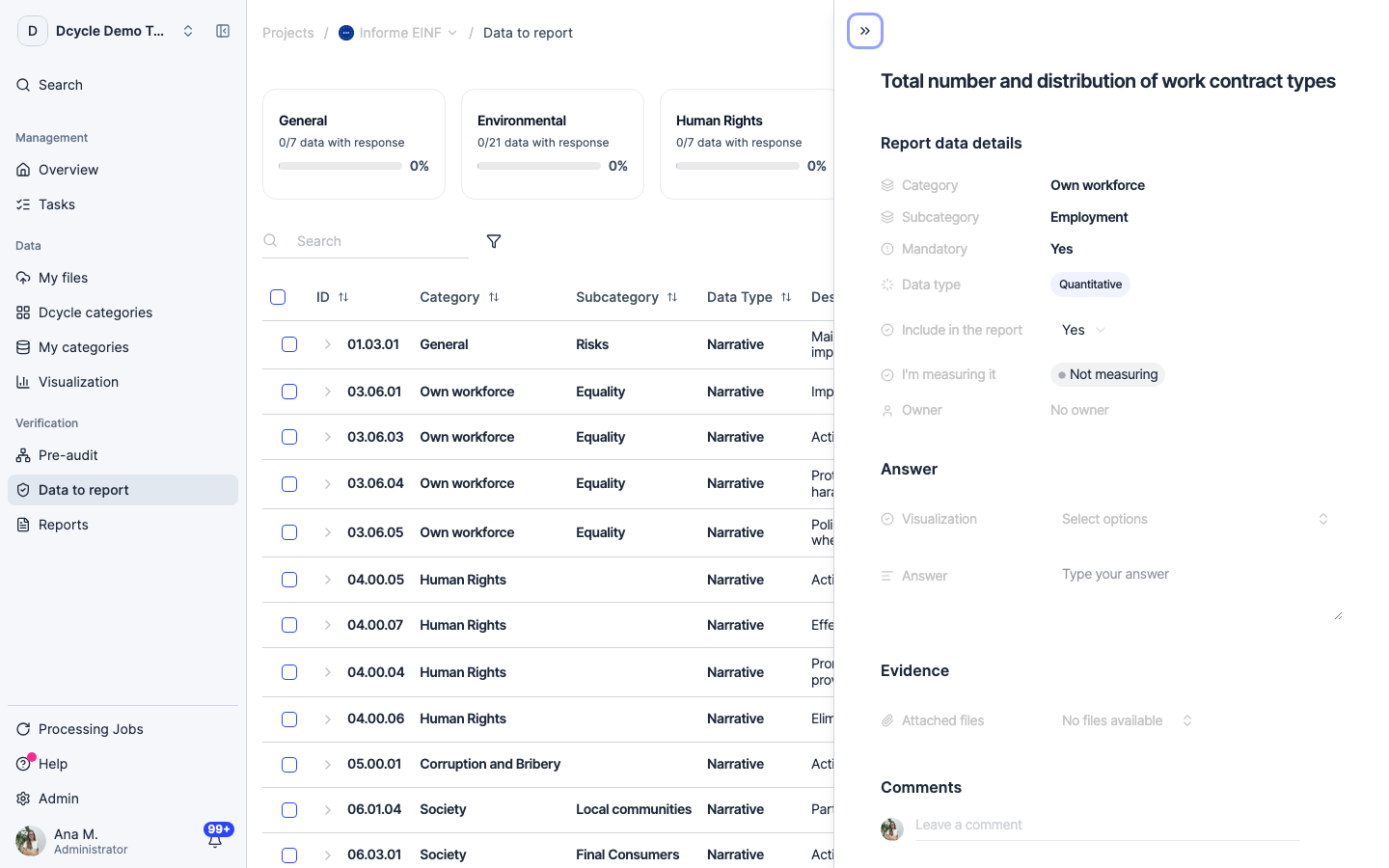
The panel is the same one every item has. What tells you this is a quantitative item is the “Data type” badge in the details, reading “Quantitative”: its answer comes from the “Visualization” field under Answer rather than from text you write.
Step 8
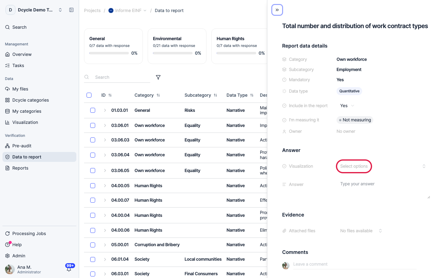
Click “Select options” to list the visualizations in this project and pick the one that supports this item — the energy consumption chart for an energy item, not the emissions one.
Step 9
Use the “Answer” field next to it for the note the number needs: the unit (MWh, m³, t, headcount), what is in and out of the boundary, and the calculation method. Check the visualization’s date range while you are at it — one built for a different year will happily attach itself and answer with the wrong period. Your verifier reads that line to trace the figure back to the records behind it.
Step 10
If “Visualization” never stops loading and the Visualization entry in the left menu has a padlock, the project was created by a parent company and its data is read-only for you. Create the EINF project from your own account to build and attach visualizations.
Step 11
Attaching a visualization is a link, not a copy: correct the underlying data or edit the visualization and the item keeps pointing at it, so the report picks up the corrected figure without relinking.
Was this helpful?
What was missing or unclear? (optional)
Sent. Thank you for helping us improve.